

There are two core elements to generating qualified leads online for your real estate investing business.
Whether you’re a wholesaler, flipper, buy and hold investor / landlord, rent to own, note buyer, even self-storage… the lifeblood of your online lead generation hinge on these 2 elements.
- Traffic – Getting qualified people to your website
- Conversion – Getting as many of those qualified people who need your services to engage in your website by entering their information or calling you on the phone
Both elements are a big deal because you can have all of the qualified traffic in the world, but if your real estate investing website’s aren’t converting well… you’re leaving tons of money on the table.
And if your website is the best converting thing since sliced bread… but you don’t have any qualified people visiting your website, it’s almost like keeping a Ferrari in the garage and not letting it hit the road and do what it does best.
In today’s post we’re going to run through some examples of ways you can boost the number of leads you get with your real estate investing websites without having to generate any more traffic. Now, this is assuming you’re already pulling in a consistent stream of qualified leads.
You can also download a simple checklist that you can save on your computer or print off as a handy reference when you’re making these changes on your website.
7 Of The “16 Points To Check Off” To Boost The Performance And Leads On Your Real Estate Website
Here 7 of the 16 points to check off as you’re building or optimizing your own real estate websites to convert more qualified visitors into leads. Some of these may seem obvious, but sometimes the seemingly simple tweaks can make the biggest difference.
Download the full 16 Point Conversion Checklist on this page below.
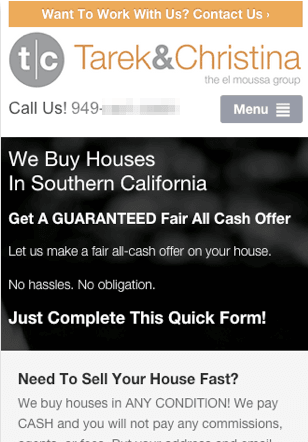
1. Put Your Main Call To Action Clearly On Every Page Of Your Website
Most real estate investor websites just have the phone number at the top of the website and the form for motivated sellers or cash buyers (or in this case note sellers) to opt in just on a few pages. Usually on their home page, a squeeze page, and maybe another one.
But we’ve found it works best to include a way for your website visitors to convert into a lead on every page… just a click away. This way they don’t have to look far to take that next step on your website when they’re ready.
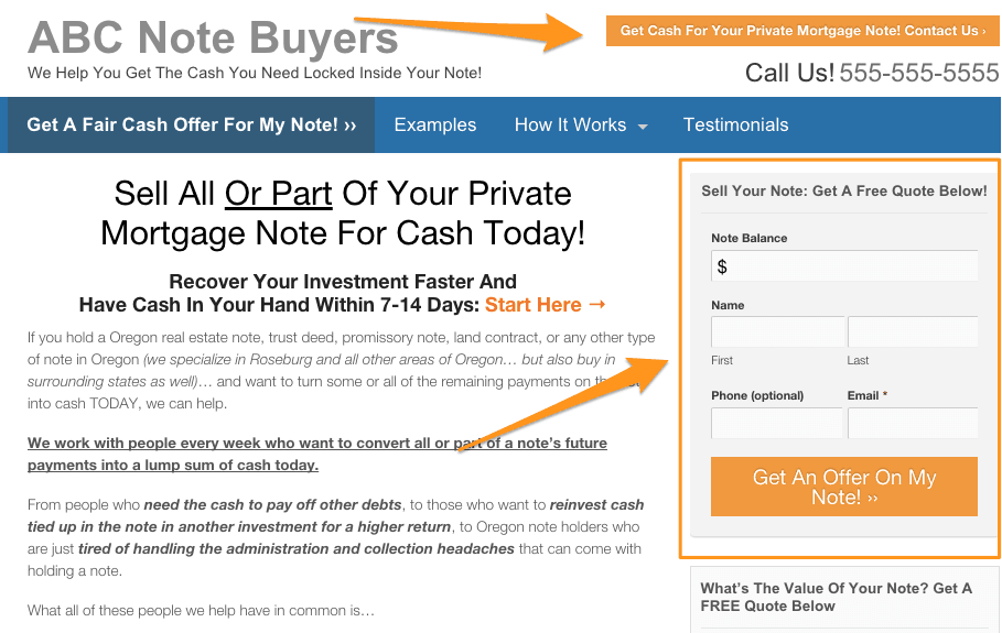
Put Your Main Call To Action On Every Page: Notice on this note buying website the multiple crazy clear calls to action? These are on every page on the website…
2. Have A Clear Benefit Oriented Headline On The Top Of Your Homepage And Main Landing Pages
Many websites we see that rank high in Google have done a great job ranking well… but then they totally fall flat when it comes to converting the visitor into a lead once they get one.
One big reason we see time and time again is they fail to show the visitor exactly how they can help them within the first 3 seconds of the visit. Be sure to add a very clear benefit oriented headline that tells the visitor the benefit they’ll get by working with you.
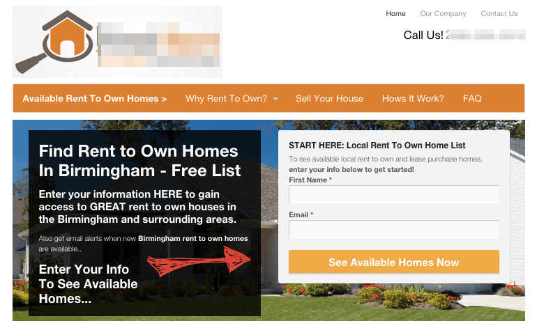
Ask yourself, “What is it that my prospect actually wants?”… then give them that in your web page headline. In this case, the rent to own tenant doesn’t want a free report, they want to see a darn list of houses. So give them that benefit and lead them to the opt in form to get it.
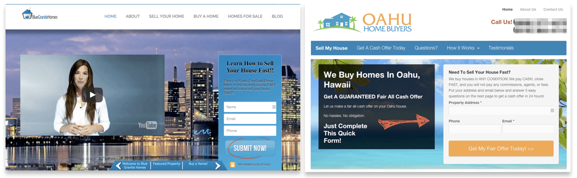
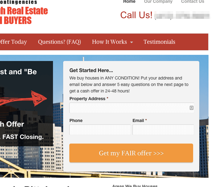
3. Use Color And Contrast To Help Your Call To Action Area Stand Out
Just like with your direct mail, bandit signs… and heck, even stop signs on the street… contrast attracts the eye.
A mistake many real estate investors and agents make is that their call to action buttons on their website blend in with the background of the website.
Take these 2 websites below as an example. Notice how the eye is naturally drawn to the action area on the page with the one on the right. The contrast with the Orange color and different background on the form draw the eye there. On the website on the left, the button is the same color as the opt in box… which is the same color used throughout the rest of the website. They blend in and the eye is instead drawn to the lady’s face on the left side of the screen.
If they add some contrast to that “submit” button so it stands out on the page, it would likely provide a small boost in conversion on the page.
Also, our tests have shown that making the opt in button have a benefit in it rather than “Submit” can boost conversions dramatically. (In this case, over 40%)
4. Ensure Your Phone Number Is At The TOP and Bottom Of All Of Your Web Pages And “Tap To Call” On Mobile Devices
 When we dig into our data over on our sister site InvestorCarrot, we often find some really interesting things.
One of the latest trends has been how important the mobile experience is for someone landing on your website. 40%+ of the leads our members generate each month come from mobile devices… but 25-35% of the traffic each month is on mobile devices. That’s a disproportional number of our leads coming from mobile devices. Why?
Because we’ve engineered a great mobile experience on our platform for motivated sellers, cash buyers, tenants, etc… and 9 out of 10 websites our members are competing with online have terrible mobile experiences.
So make sure your phone number is at the top of the website, your menu and logo are shrunk down so they don’t take up much space, and your call to action / opt in box are no more than a half swipe down the page for the mobile visitor.
5. Add Credibility Badges On Your Website
I wouldn’t suggest this as one of the first things you’d do, because there’s other more “low hanging fruit” as far as getting conversion bumps that you can do.
But in every test we’ve ran where we added a credibility badge like a BBB logo on the website… and not just on the website but at the top of the website above or just next to the main call to action form, we’ve seen an increase in the conversion on the page.
Why?
People are skeptical by nature and we look for cues as to the trustworthiness of a website. Since the BBB is a widely recognized brand and trusted source, seeing that on your website gives that warm and fuzzy feeling that you’re a safe company to do business with.
Nearly 10% More Leads From Building Trust With The BBB… This company is a client of ours at our Enterprise level (only for companies that do at least 80+ deals a year already) and they had their BBB badge on the site, but it was further down. We moved it to the top and saw an immediate boost of almost 10% more leads.
6. Don’t Ask For Too Much Information Right Away. Reduce Your Initial Form To 3-4 Form Fields Ideally
In our tests and other tests outside of the real estate industry, test after test has shown that the more form fields you ask your visitors to fill out, the lower the conversion rate.
Now you may be saying, “Ya, but the more form fields the more qualified the leads too!”
And you’d be 100% correct.
But in our tests, we’ve found that there’s the highly motivated lead who will fill out the form whether it has 4 fields on it or 8… but there’s also the “on the fence” leads that wouldn’t fill out a longer form but will “dip their toes” in on a shorter form first.
Then we pass that lead to a longer “2 step” form immediately where we’ll further qualify them. There’s a psychology term called Commitemnt and Consistency where us humans are hard wired to follow through on bigger commitments after we’ve made small ones. Our 2 step opt in process with 3-4 form fields on the first form and then the longer form on the second step convert more leads on the front end and end up getting more people to further qualify themselves on the 2nd step than if you were to ask for more information on the first form.
Make it easy for your cash buyers, sellers, tenants, and lenders to engage on your website. It can be intimidating to make a seller jump through 10 form fields on the first step. Make it easy on step 1 to get their info, then further qualify them on step 2.
7. Show Website Visitors You’re Real People Behind The Company
Many of your website visitors may be skeptical before they even land on your website. Motivated house sellers may have heard about the “house flipping scams” on the news (that of course have nothing to do with how you run your business) and project that fear on every house buyer they come across.
The same goes for selling investment properties. Too many people list bogus houses on their websites or they don’t ever list any at all and are building a cash buyer list without taking any real action to get any properties on the site… and it can breed skepticism.
One way to combat that is to connect with your website visitors on a more personal level.
Show them you’re a real person behind the company.
According to a Stanford study called the Stanford Web Credibility Research study, several of the top 10 ways to increase the credibility of your website involve you just opening up and showing you’re real.
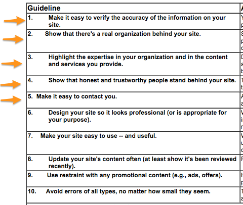
Stanford Web Credibility Research Results: The orange arrows point to the credibility elements that involve you making it easier to connect with you as a person. It matters.
You can do this by…
- Building out a simple about page that has a picture of you / your team and what you stand for
- Making it easy for people to contact you
- Show that you have the expertise to help them (testimonials are amazing validators of your expertise)
Just get creative and connect with your website visitor on your website the same way you would in person.
Download The Rest Of The 16 Carrot Conversion Points Checklist Below!
I hope you have at least 1 or 2 things you can implement in the 7 real estate website conversion tips above.
We’re continually testing and improving the effectiveness of Inbound Online Marketing websites for investors and agents so our members can focus on what they do best.
Feel free to share this with your colleagues and implement some this week!