


Ever heard of “heat maps”? We’ll show you how motivated sellers interact with your website and how to make your website more effective….
Are you putting in lots of effort into building a really kick ass marketing site to pull in buyers, sellers or investors… but not getting the results you want?
There are two main problems that we often see on real estate investment sites:
1) The site is getting no visitors, and
2) The site’s visitors aren’t submitting their information.
The first problem is usually solved with SEO content when:
1) The site doesn’t have good content,
2) The content is not optimized to reach the search terms that people in the local market are actually using, or
3) The site’s competitors are ranking higher in search.
There are quite a lot of other tricks to boost traffic to your site, and we’ll be talking about that again real soon…. But today, I want to help you out with the second main problem we see:
What are people doing on your site?
It’s critical that the design of your site is set up to actually convert visitors to leads.
Although it’s utterly crucial, conversions are often overlooked when average people are putting together their websites. Too often they hire designers who are obsessed with aesthetics… rather than results. Those folks need to quit calling themselves marketing experts… because they’re artists. Most art doesn’t sell. It hangs there, looking pretty… but it’s not selling your business.
Are you trying to create art, or are you trying to get real estate investing leads?
Listen, I get in this argument with designers a lot… so please don’t send me a bunch of angry emails about how design matters… I know it matters. It’s just that it doesn’t matter if it’s pretty… it matters if it works. Like with my accountant – I don’t care if my accountant is pretty, I care about what happens if I get audited.
When you’re setting up your real estate site, it’s not how it looks… it’s how it works.
That’s the really cool thing about heat maps – one of the many tools that we use at InvestorCarrot to test out our theories of web design… because we don’t even trust ourselves – we want to know that our system is built on proven data about what works before we commit your hard earned cash – and more importantly, before you shift the marketing of your business to our system. We know your business is super important to you… just like ours is to us.
So what’s a heat map anyway, and how can investors use it to generate more leads online???
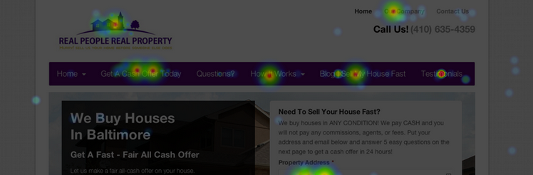
Back to the point, thanks… in this context, a heat map is a generated picture of where visitors to the website move their mouse and where they click on the page.
Below I’m gonna put a few examples of a heat map that we generated for a user’s site, and give you a few key points on what works so well on this design.
Brittany (the owner of http://sellmybaltimorehousefast.com) sent us a quick email after watching one of our webinars, asking for help getting more leads… we were able to double her conversion rate with just a couple of simple changes that I’ll get to soon.
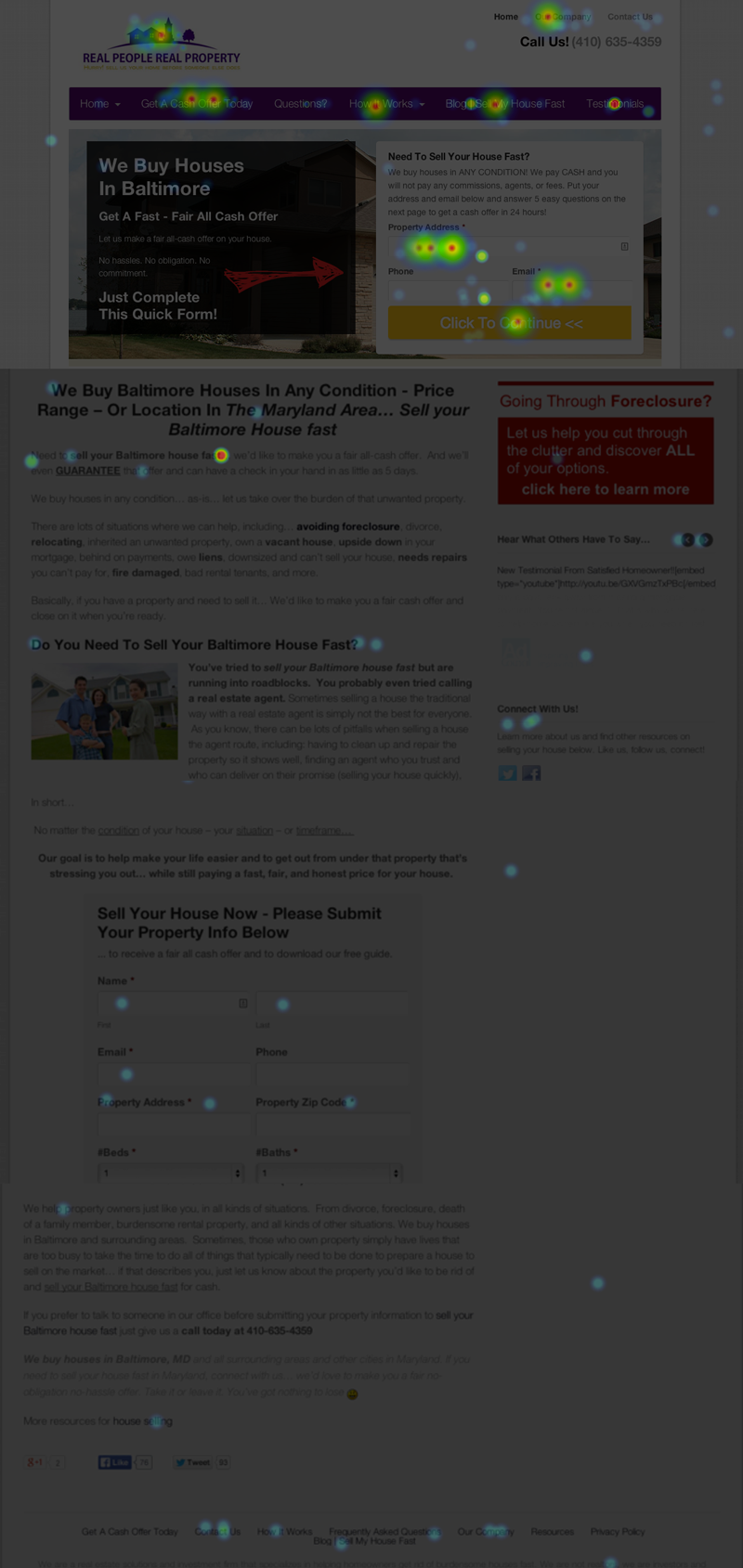
Check out these heat maps (the site is greyed out, with little points of light showing where people have lingered with their mouse or clicked – the “hotter” the click spot, the more often it’s clicked).
What did you notice on that heatmap?
See all of the bright spots? The Orange and Yellow spots are where a lot of people click… indicating things that the motivated sellers felt were really important.
First off, 94% of clicks happen on the top of the page. The vast majority of web visitors to any given site don’t bother to scroll down – in fact, they make the decision to stay or go on to another site within 2.3 seconds.
Side note: That statistic is valid across websites in general – on our investment sites, we tend to get about 8 seconds per page on average – 4 times more engagement than average, but still a lightning-fast choice to stay or go. You only have microseconds to reach your target audience – just another reason that your content and design matter so much.
There are a few great lessons to learn right away from this click map….
1) People are clicking in many spots. The clicks aren’t just happening in one spot… visitors to Brittany’s site are clicking through to find information that answers their questions. The site is designed to appeal to a specific audience (sellers), so it’s validating to know that different visitors to the site are finding what they’re looking for on the site – and then submitting their information.
2) Titles matter a lot. Check out the title of Brittany’s top menus – these titles are designed to appeal directly to people who need to sell. “We buy houses in Baltimore”, “Get A Cash Offer”, “Sell My House Fast” and a contact form right on the front page that asks people to put in their address, phone and email first thing.
3) Customers want to know about the company before they submit their info. Check out how red the spot over the testimonials – not only are people clicking a lot on that page, but they’re thumbing through the testimonial mini-display on the bottom right of the page. Testimonials are a huge way to create credibility for your business… more on that in a minute.
Where is your credibility on your own real estate investor websites?
It’s a really common problem that hurts a ton of great real estate investors… when people get to the site they need to have a compelling reason to give over their personal information. Think about it… real estate is the largest investment most people ever make in their lives. There’s no piece of real estate more intimate than someone’s home.
And yet…
So many real estate investment sites don’t build trust or credibility.
In fact, there are 3 key factors that I wanna mention that are critical to successfully designing a site that converts – and I’ll tell you how we’ve used them to design the InvestorCarrot sites like Brittany’s that are generating great leads.
Credibility, Content, and Contact
Check out this graphic – I’ve broken down the links on the page into numbers, so you can see the percentage of page visitors that clicked on each link or form.
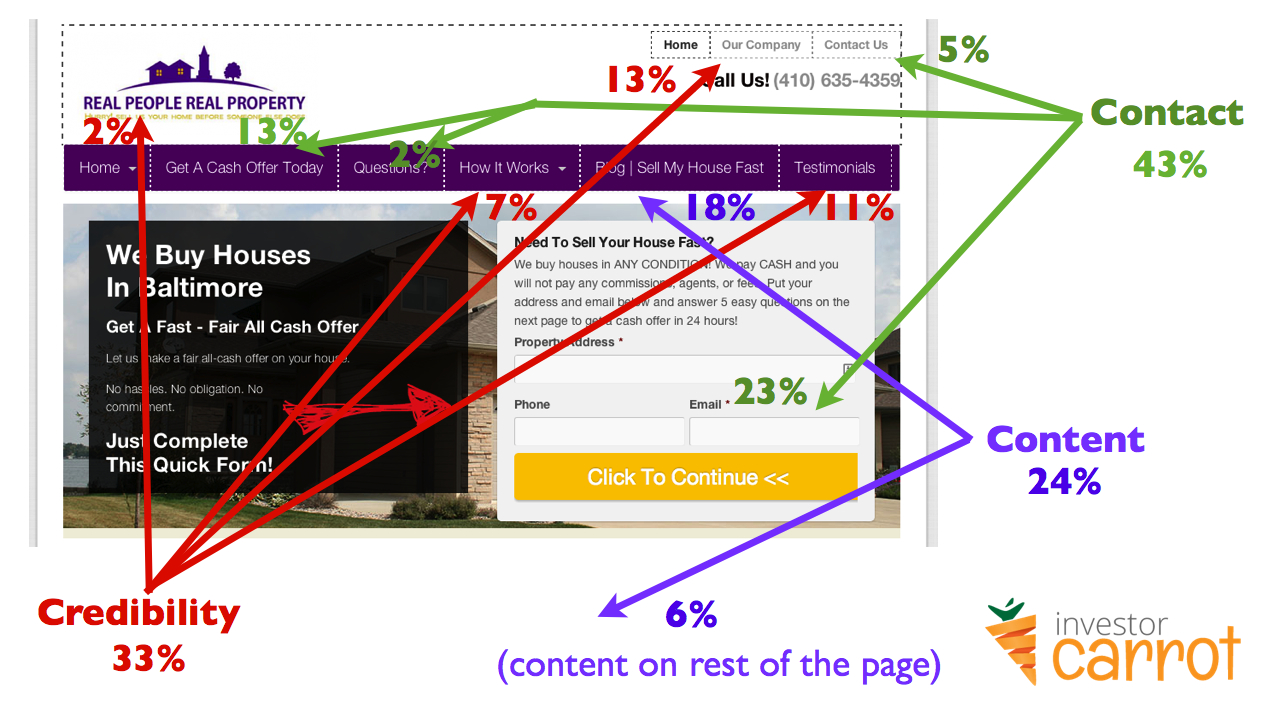
Even more great lessons for real estate investors here…
As you can see, 33% of the clicks are for Credibility, 24% is on the Content (which is written to develop trust and credibility while reducing the fear and anxiety that most people who need to sell now are feeling), and 43% of the clicks on the home page are actually converting – they’re contacting Brittany using the forms.
Now, keep in mind that the percentages are recording just clicks on the home page – a lot of other conversions happen on the lead pages that we’ve optimized for the local market. That means that people are most often giving their info over to get a free report or another valuable tool… the 43% of the clicks on the home page isn’t always the main source of leads. It just depends on how the site is being promoted, and where the majority of traffic is directed.
I really want to emphasize that the mix of those 3 factors is critical to a successful lead generation site.
Content pulls people through search engine traffic, but it has to create Credibility once people arrive… or they just won’t Contact you.
BONUS: 1 Minute Tweak That Doubled The Conversion Rate To Leads
One more thing… I promised that I’d tell you the simple fix that we did on Brittany’s page that doubled conversions… it’s so crazy simple that we were totally surprised that it worked so well.
We increased the size of the bar that says “Click to Continue” on the opt in form and changed the color to Orange.
Yup, that’s it.
When Brittany got in touch, her site was converting well… but she’d made the size of the Continue button pretty small and black… so we ran a split test – half of the visitors to the site saw the small button, and the other half saw the larger button (we also changed the color to yellow).
In just one month of running the test, visitors to the large-button site submitted their info twice as much as those who saw the small button. Wow!
Even after doing this stuff for years, it’s crazy to see what a big difference such a small change can make.
That’s why we’re constantly testing different sites. We love to learn the nitty-gritty details that make all the difference… we don’t rely upon assumptions, and we certainly don’t make our websites to be pretty – although we do think they look nice. Most important – we design them to be effective.
For marketing folks who love data, heat maps are a fantastic tool.
This Is All Built Into Your InvestorCarrot Websites Already!
The beauty with everything we walked through in this post is that everything is already baked right into your InvestorCarrot websites. We’re constantly running tests with our members and making tweaks to improve how well our system works for you.
We get paid up to $6,000/mo by large companies to do this same kind of work for them… but you get this as part of your InvestorCarrot membership for no extra cost. Why? Simply because we believe in results over anything else and are continually improving our system to help you get better results.
Keep An Eye Out For More Articles Like This!
We’ll be posting lots more info on the tips, tricks and techniques we use to improve SEO, conversions and get great results for InvestorCarrot customers… so if you’re not already getting our emails, make sure you sign up now! And if you want a website that truly generates leads for your business, go check out oncarrot.com/plans to join Carrot and leverage our marketing knowledge and testing to generate more leads for your own real estate investing company.